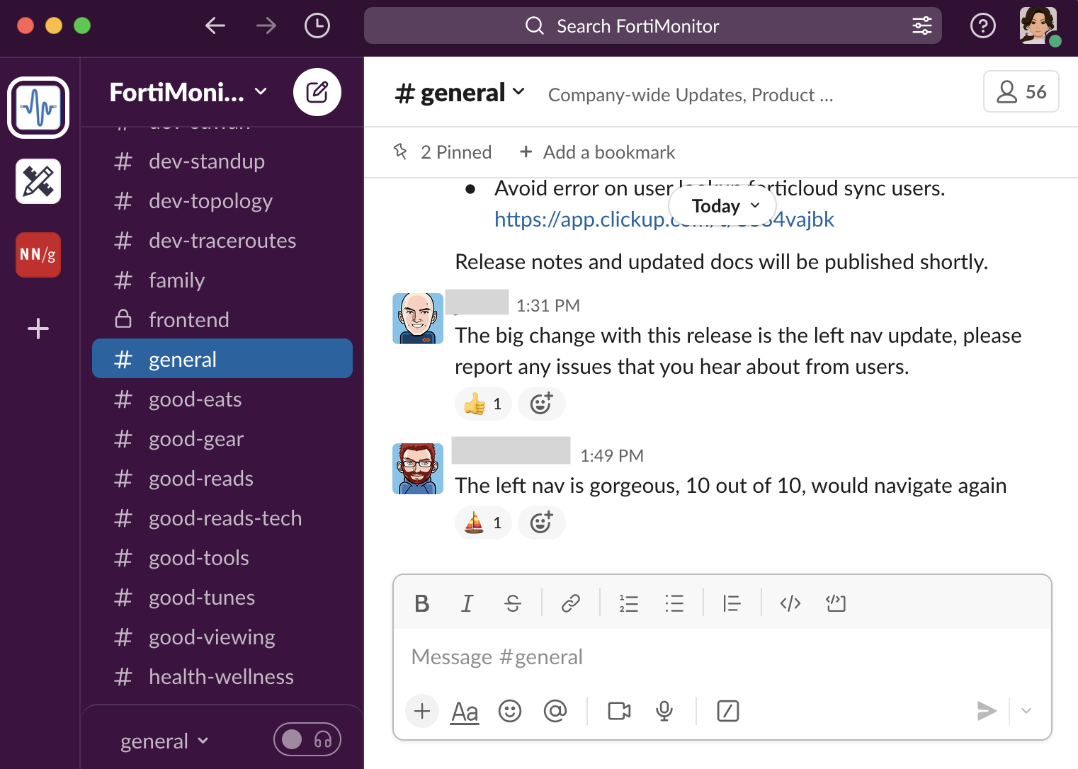
Revamped Panopta’s information architecture and user experience to create an intuitive, scalable solution that integrates seamlessly with Fortinet’s ecosystem.

Designing FortiMonitor: From Startup To Scale
Network & Infrastructure Monitoring · Fortinet · Staff Product Designer
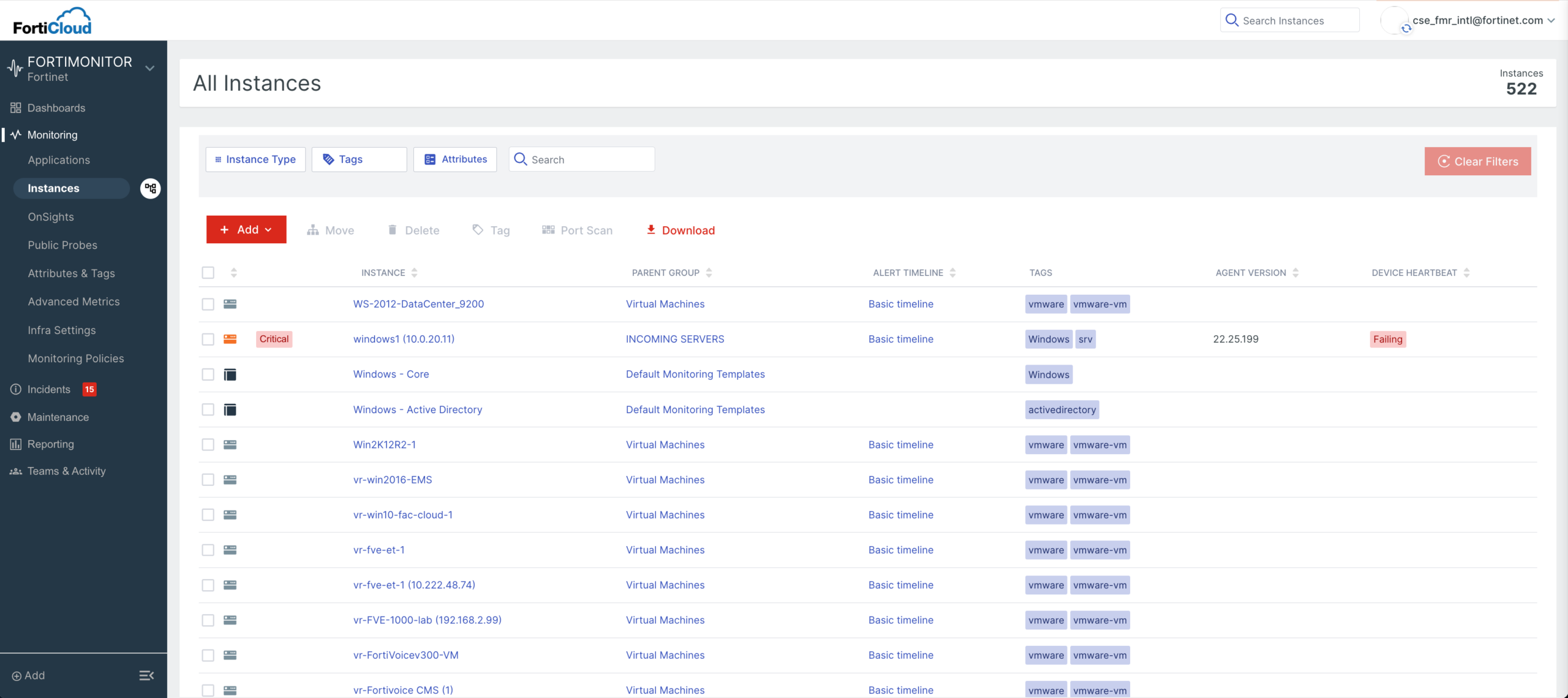
After Redesign
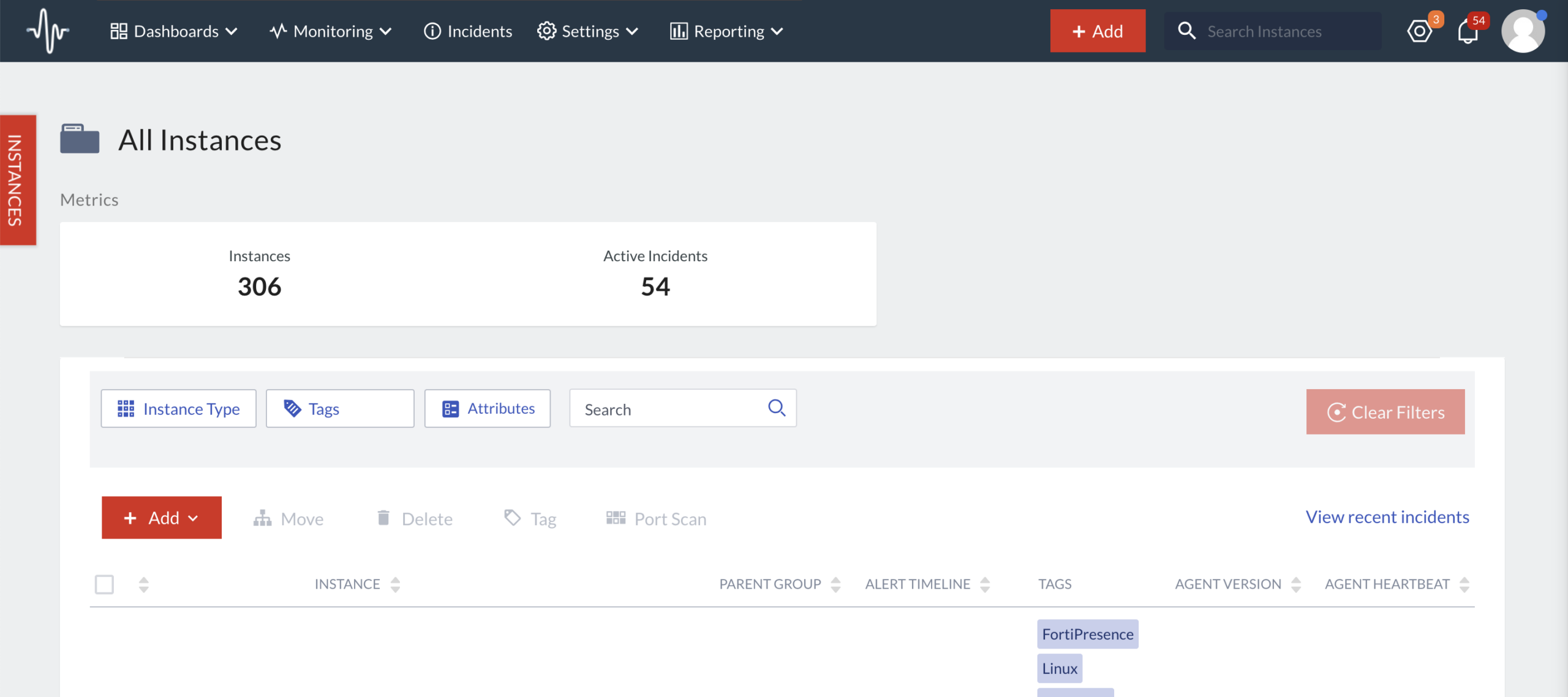
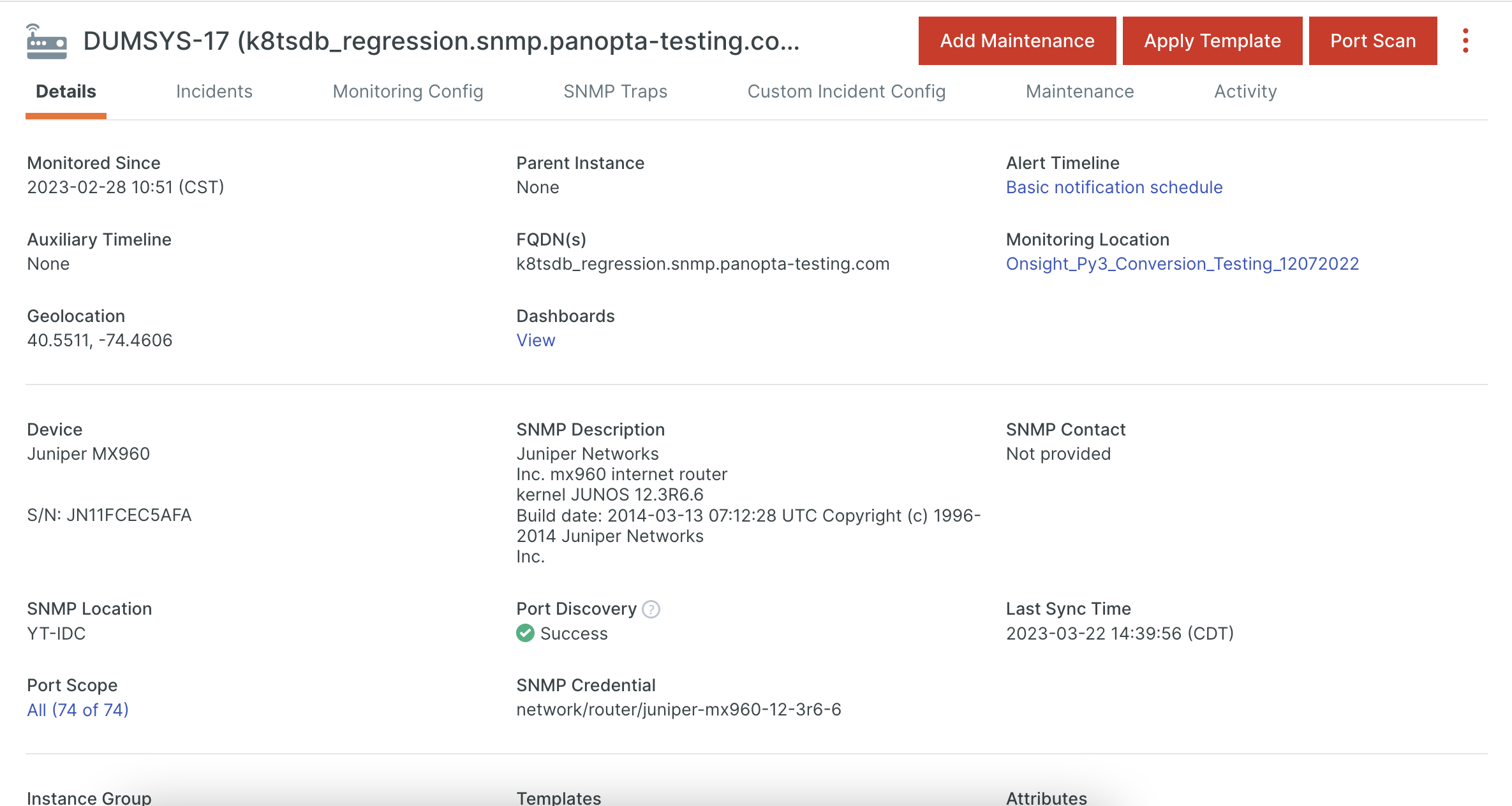
Before Redesign
Background
After Fortinet acquired Panopta, a Chicago-based monitoring startup, the product needed to evolve from a niche monitoring solution into a scalable platform that could integrate seamlessly with the broader Fortinet ecosystem.
About Product
Panopta, now called FortiMonitor, is Fortinet’s cloud-based infrastructure and network monitoring platform. It unifies visibility across servers, networks, containers, and applications, helping enterprises catch and resolve performance issues before customers feel them.
Who uses it: NOC teams, DevOps engineers, and IT operations teams in enterprise environments, often working in high-pressure on-call rotations where a slow path to the right signal directly delays incident response. They live in the product daily and care about one thing above all: getting from “something’s wrong” to “here’s what and where” in seconds.
My challenge: Simplify a technically dense system into an intuitive, scalable experience for those users — one that can grow with Fortinet’s enterprise base instead of buckling under it.
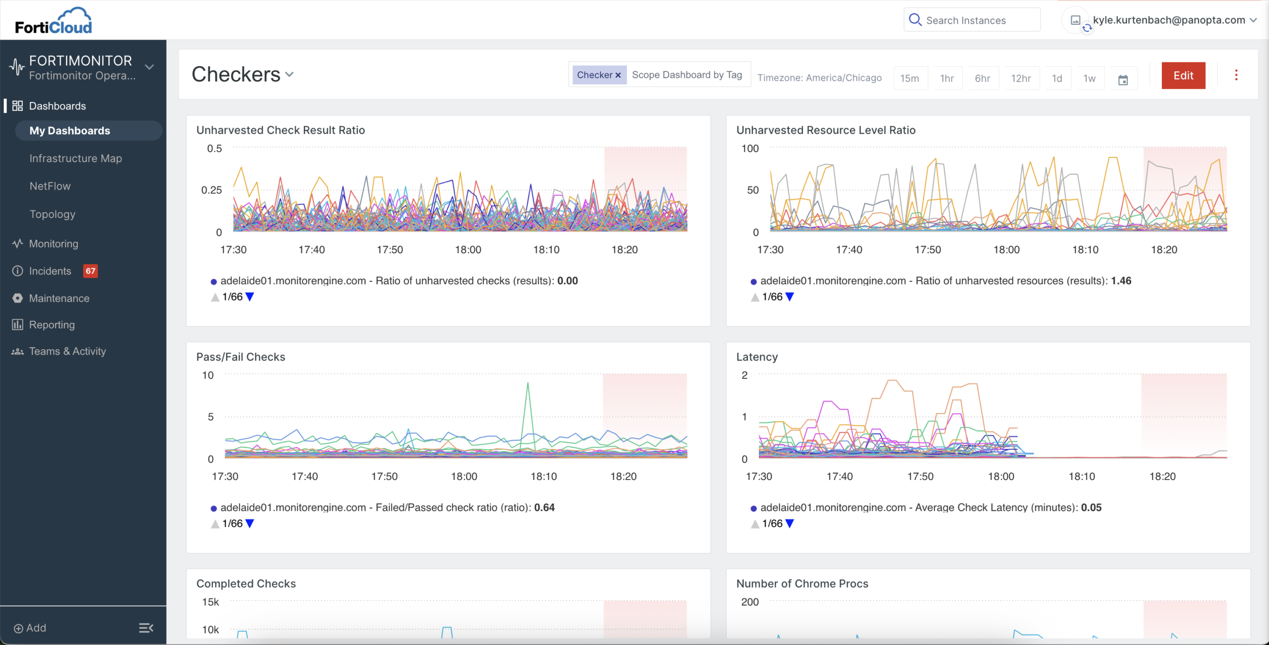
FortiMonitor Dashboard
My Role and Influence
I lead design for FortiMonitor and have influenced product evolution by:
- Aligning cross-functional stakeholders across product, engineering, and adjacent Fortinet teams by running discovery sessions, sharing research insights, and building consensus on how the product should evolve within the broader ecosystem.
- Translating ambiguous post-acquisition goals into a clear, phased approach (IA → IAM → Fabric integration) that the team could execute against.
- Advocating for a user-centered IA redesign over feature-first expansion, pushing back on adding new features into an already complex navigation, and instead prioritizing findability, task clarity, and scalability.
- Conducting research and validation efforts end-to-end (user interviews, card sorting, tree testing), ensuring that navigation decisions were grounded in user behavior rather than assumptions or internal biases.
Discovery & Research
To learn how the product is being used now and what the roadmap looks like, I began by immersing myself in both organizational and customer perspectives. I started with –
-
Listening tours: I met with engineering, product, sales, and customer success teams to understand pain points and expectations.
-
Cross-product research: Partnered with PMs across Fortinet products to learn from their post-acquisition integration experiences.
-
Customer interviews: Conducted interviews with our existing customers to uncover what worked in Panopta and where they struggled.
Key Findings:
-
Strong need to integrate seamlessly with Fortinet’s ecosystem (IAM – Identity and Access Management, and Fabric).
-
Navigation structure was a problem –
– Users struggled with findability: long menus and cluttered pages made navigation frustrating.
– Transient navigation made it difficult for users to know where they were and where they could go next. -
Early post-acquisition meant ambiguity in ownership and decision-making, requiring strong facilitation.
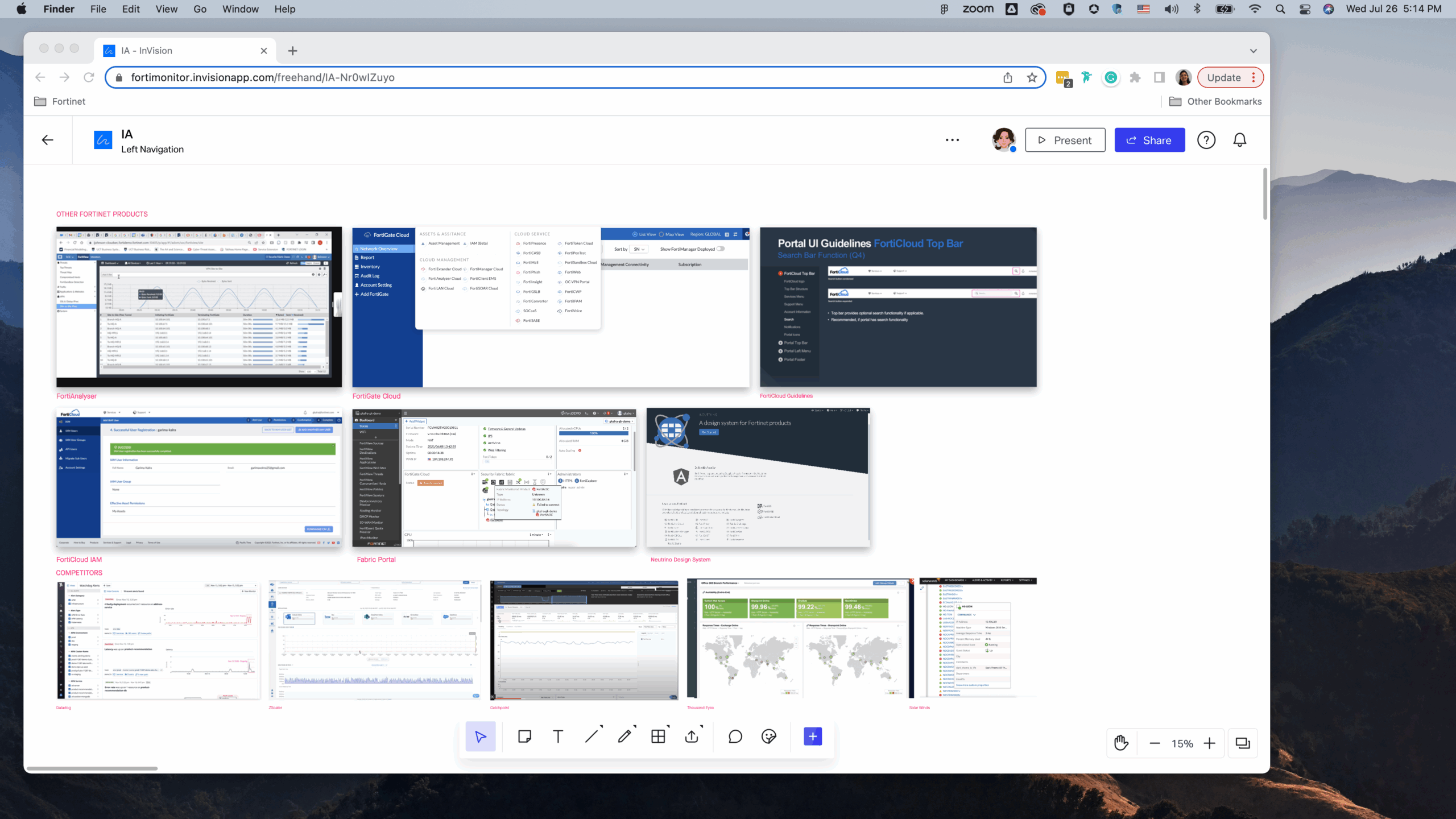
Information Gathering from listening tours -
other Fortinet products and competitor products
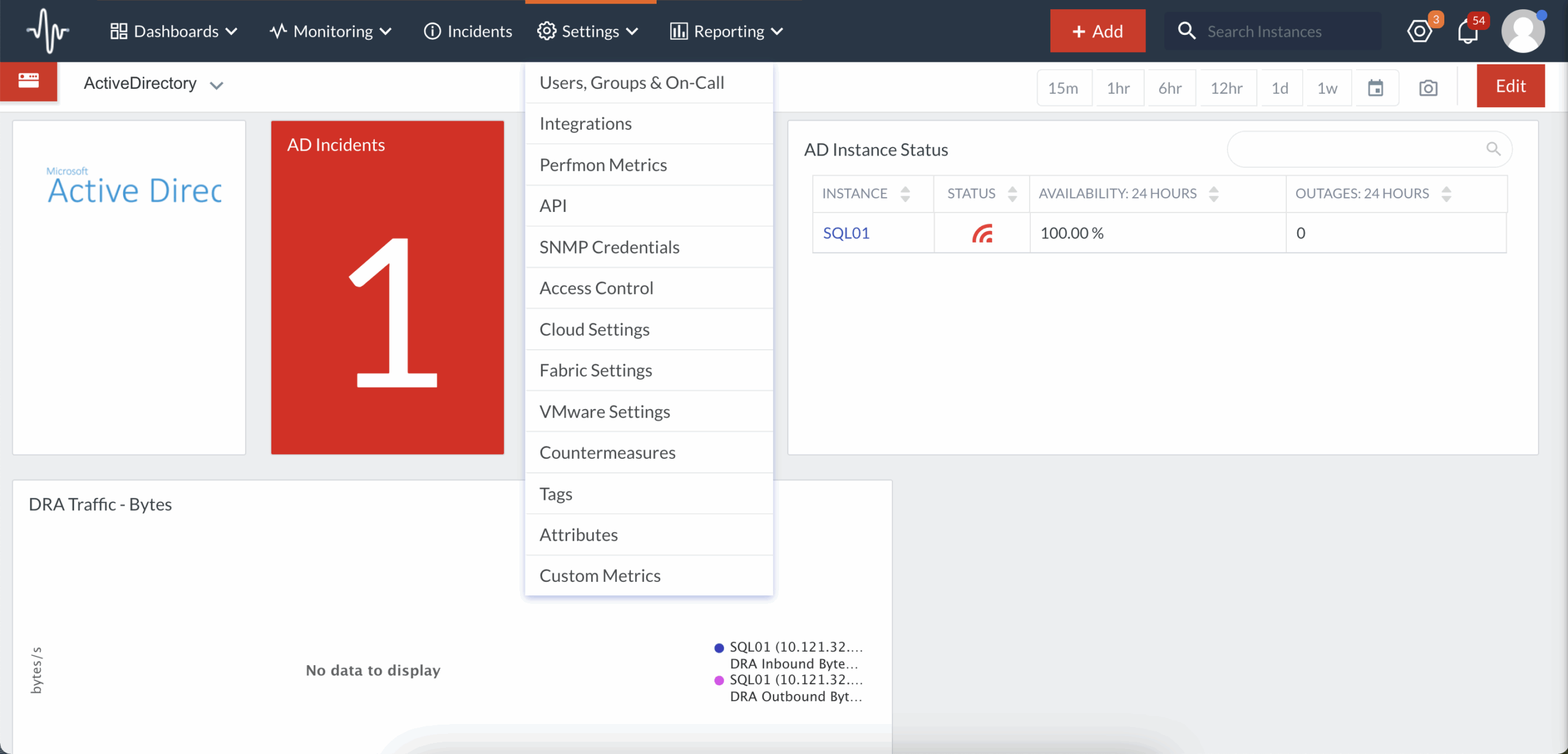
One of the menus from old navigation
To align stakeholders, I facilitated discovery and prioritization workshops, breaking the next steps into clear phases:
-
Redesign the Information Architecture.
-
Integrate with FortiCloud IAM.
-
Plan for Fabric integration.
The Decision That Set the Direction
Post-acquisition, there was real pressure to move fast. Leadership and product teams wanted to start bolting Fortinet ecosystem features onto FortiMonitor immediately, to show integration progress. But navigation was already the #1 pain point in our research, and I knew adding features to a broken structure would compound the problem, not signal momentum.
So I made the case to leadership and the product team: fix the foundation first. I brought the card-sort and tree-test data to [a specific forum — e.g., the roadmap review], reframed the goal from “ship integrations” to “make the product scalable enough to absorb integrations,” and proposed the phased plan (IA → IAM → Fabric) as the way to get both.
Redesign Information Architecture
The priority was to improve information architecture by not only reorganizing the main navigation but also clearly defining different objects and their relationships. Using insights from initial information gathering through listening tours and interviews, I created a research plan to re-architect the IA.
-
Card Sorting: Conducted open and closed sorts with both customers and cross-functional teams.
-
Tree Testing: Ran a round of validation to measure task findability in the new structure. This confirmed key improvements and highlighted areas for adjustment.
-
Usability Testing: Watched users use our control panel to complete tasks on primary/top-used pages.
- Product Analytics: Looked at heat maps to see the most clicked areas on a page and typical paths users take from a page.
What the card sort revealed — and what I did with it
I ran an open card sort with about 20 customers and cross-functional participants, then analyzed the similarity matrix to see which items users consistently grouped. Five broad affinity clusters emerged:
- Monitored objects — EBS, EC2, VMware, Active Directory, and Apache grouped tightly. Users think of the things they monitor as one family.
- A large “everything configurable” blob — Access Control, Users/Groups/On-Call, credentials, API, Integrations, Monitoring Policies, Tags, Custom & Perfmon Metrics, and Countermeasures all clustered together.
- Operational events — Active Incidents, Alert Timelines, and both Maintenance items clustered as “things happening on a timeline.”
- Views & outputs — Dashboards, Infrastructure Map, Application Overview, instance browsing, Reports, and Status Pages.
- Account & utility — My Account, Account History, Support, Product Updates, and Logout.
The most important read wasn’t the clusters themselves — it was their coarseness. The card sort didn’t hand me a menu. In two places, it reproduced the confusion I was trying to fix: users lumped everything configurable into one pile (exactly like the old Settings menu had trained them to), and they merged planned maintenance with unplanned incidents. So the design work was interpreting the data, not transcribing it:
- I split the “everything configurable” blob by what each setting governs. The tighter sub-groups inside it — account/access vs. monitoring config vs. incident tooling — told me users could separate these once context was clear; they only piled them together because the product gave them nowhere else to go. Monitoring config (Tags, Metrics, Policies) went to Monitoring; account and access (Users, Access Control, API, Integrations) went to Teams & Activity; Countermeasures went to Incidents.
- I separated Maintenance from Incidents even though users grouped them. They clustered together because both live on a timeline — but maintenance is planned, and incidents are unplanned: a different mental mode and urgency. Leaving planned downtime buried inside incident response was part of the original problem, so I promoted Maintenance to its own top-level section.
- I split “views & outputs” by intent — live monitoring views (Infrastructure Map), anchored Dashboards, while Reports and Status Pages — things you generate and share — became Reporting.
That interpretation step is where the IA actually got designed: the research told me how users currently think; my job was to decide where that thinking should be honored and where it was an artifact of the broken structure.
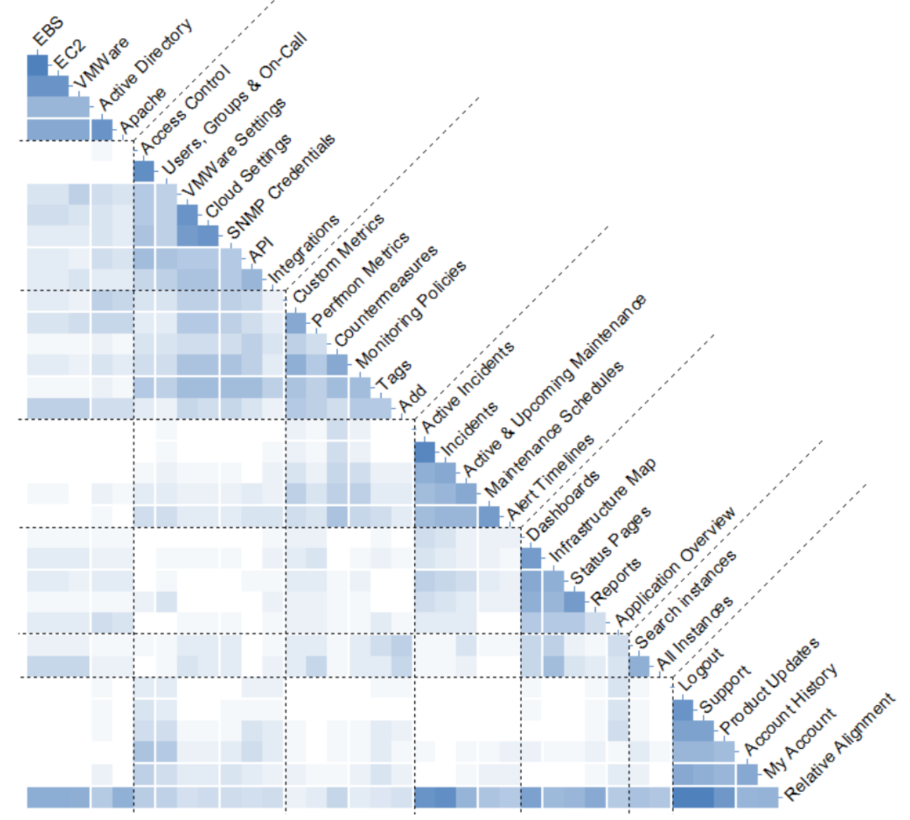
Similarity matrix from card sorting
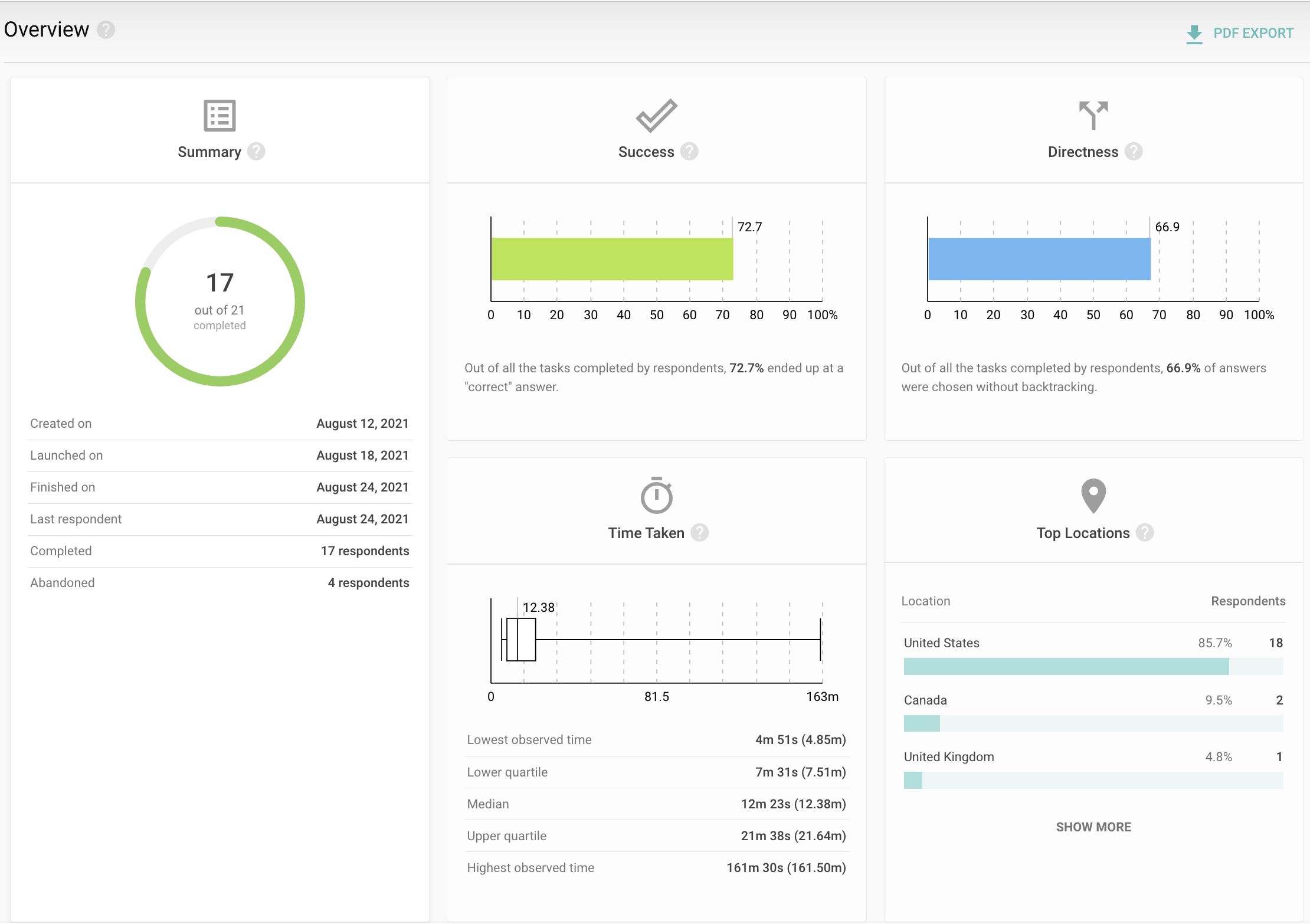
Tree Testing Result Dashboard
The New Information Architecture
The research gave me a clear mandate: users navigate by what they’re trying to do, not by how the system is built. They separated, looking at their infrastructure from setting up monitoring from responding to incidents, and the old IA violated all three by scattering related tasks across unrelated menus. The worst offender was a global Settings menu that had grown into a 13-item junk drawer, mixing account admin, monitoring configuration, and incident tooling with no logical order.
I restructured the navigation around six task-based destinations, and re-housed every configurable item next to the thing it actually configures.
Five structural decisions
1. Dashboards became the “see your environment” home.
The old Dashboards menu listed every user-built dashboard as its own menu item — it grew without limit. Meanwhile, Topology, Netflow, and the Infrastructure Map were buried under Monitoring because there was nowhere better to put them, even though users treated all of them as views. I collapsed every personal dashboard into a single My Dashboards entry, moved the visualization tools here, and promoted the Infrastructure Map to the landing screen — a heatmap of all monitored infrastructure, grouped by criteria like infra groups, so that an on-call user sees system health the moment they log in.
2. Monitoring became the monitored objects and their setup.
In the old structure, the things that define monitoring at scale — Tags, Attributes, Custom Metrics, Monitoring Policies, and Cloud/Fabric/VMware settings — were exiled to the global Settings menu, far from what they govern. The card sort showed users grouping this configuration with the objects it applies to. So, Monitoring now holds the monitored entities (Applications, Instances, Onsights, Public Probes) alongside the controls that shape them (Attributes & Tags, Advanced Metrics, Monitoring Policies), and I consolidated the three separate infrastructure connection settings into a single Infra Settings item.
3. Incidents absorbed its own tooling.
Countermeasures and Alert Timelines were incident-response tools stranded in Settings and Monitoring. I moved them under Incidents, so everything involved in detecting and resolving an issue lives in one place.
4. Maintenance was promoted to a first-class destination.
Previously buried as “Maintenance Schedules” under Monitoring, it surfaced in the card sort as its own group every time. I made it a top-level item with Active & Upcoming and Schedules & History, matching how teams actually plan around downtime.
5. The Settings junk drawer was dissolved into Teams & Activity.
Once each setting moved to its rightful context, what remained was genuinely account-level administration — people, access, integrations, and usage. I renamed and rescoped this to Teams & Activity, reframing it from “everything configurable” to “who’s on the team and what they can do.”
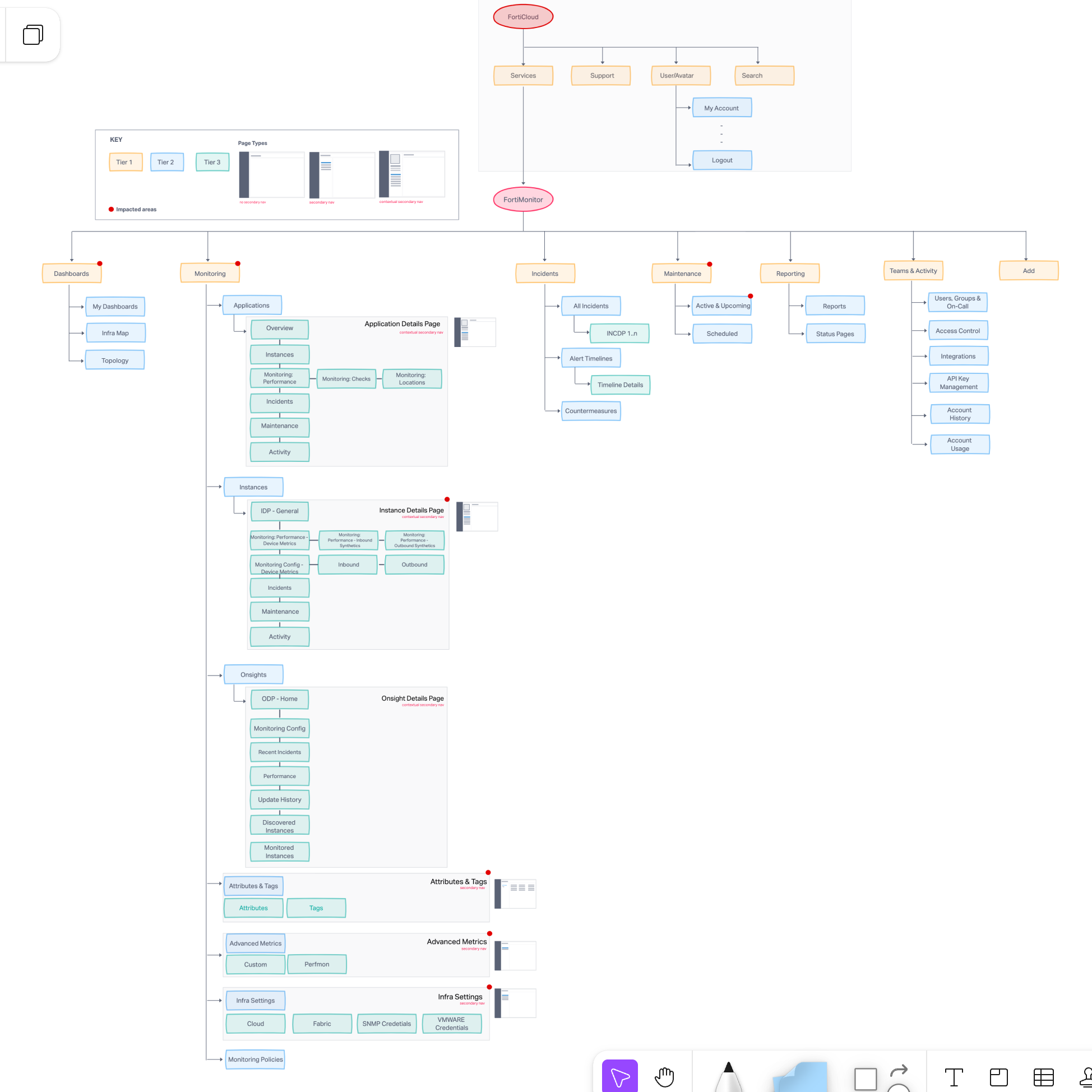
Revised IA
Design Iterations
To help the team visualize the impact of these changes:
-
Began with sketches and low-fidelity wireframes.
-
Iterated into mid-fidelity prototypes, exploring both primary and secondary navigation patterns.
-
Shared weekly updates with engineering and product to align design decisions with technical feasibility.
The biggest challenge was balancing navigation redesign with future scalability, ensuring we weren’t just solving for today but also enabling growth.
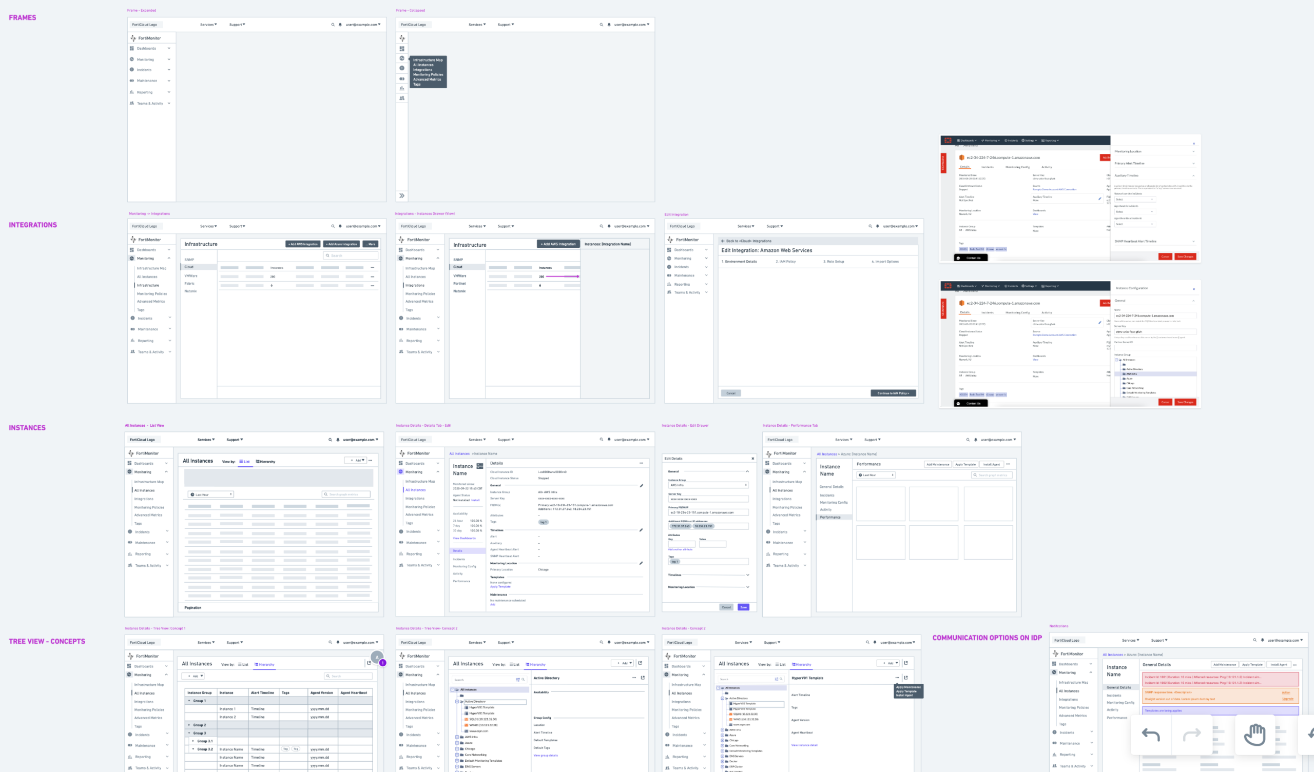
Lo-Fi's
Validation
Before finalizing, I embedded a usability testing widget directly inside FortiMonitor to recruit customers. This allowed users to test the new navigation at their convenience, giving us broader and more representative feedback.
The usability tests focused on:
-
Task findability in the redesigned IA.
-
Language and labels for clarity.
-
Layout and hierarchy of the new dashboard.
Iterating on this feedback ensured that the final design reflected real user needs, not just internal assumptions.
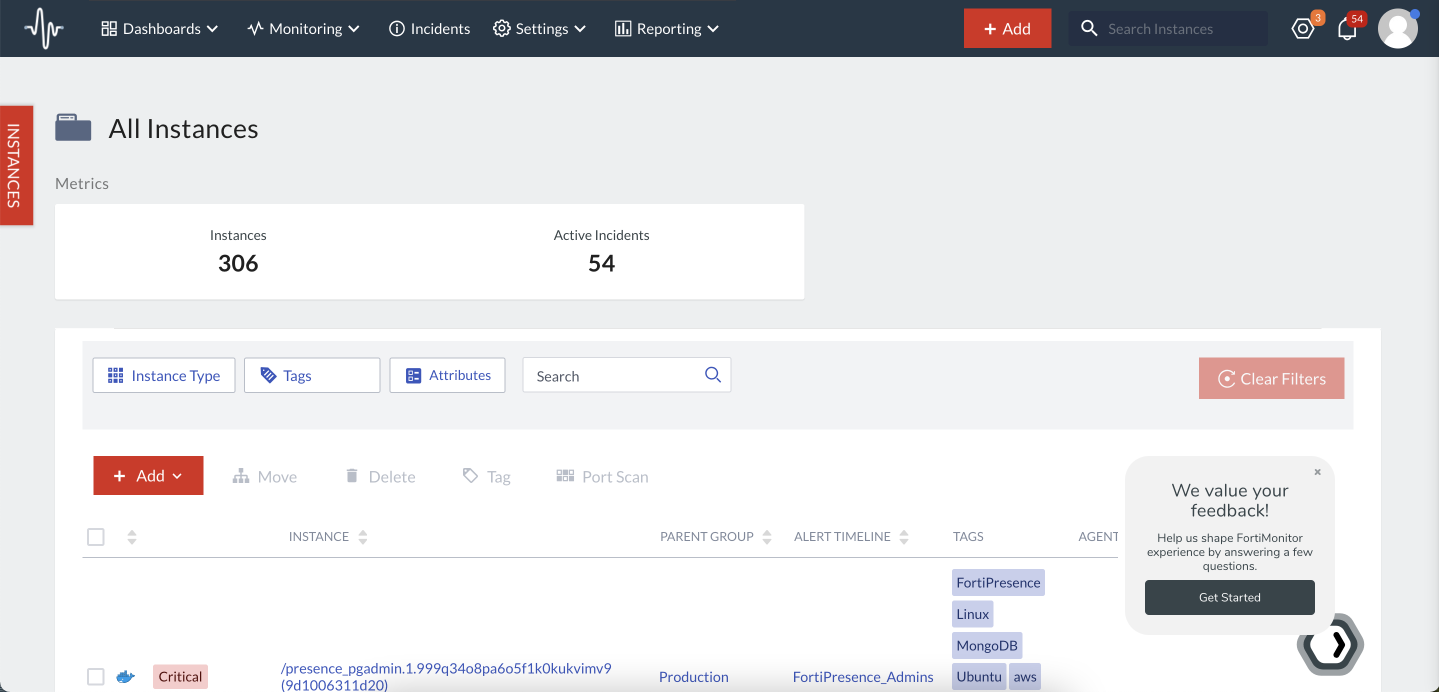
Usability testing widget embedded in production env.
Execution
With the IA finalized, I partnered closely with six front-end engineers and the engineering manager to deliver the redesigned experience. My contributions included:
-
Providing design specifications and reviewing builds.
-
Designing an in-app announcement and guided walkthrough (via Pendo) to onboard users to the new experience.
-
Supporting QA to ensure consistency with the Neutrino design system.
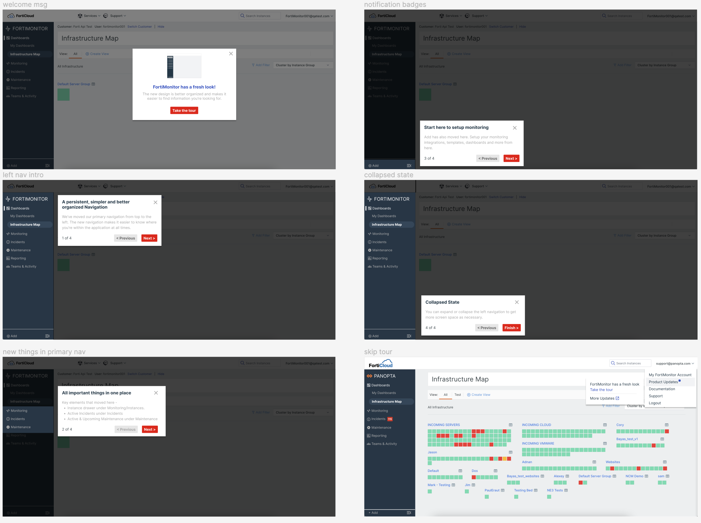
In-app announcement - guided walkthroughs
Design - Before IA revamp
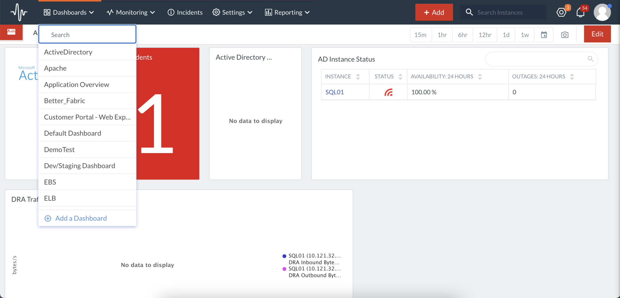
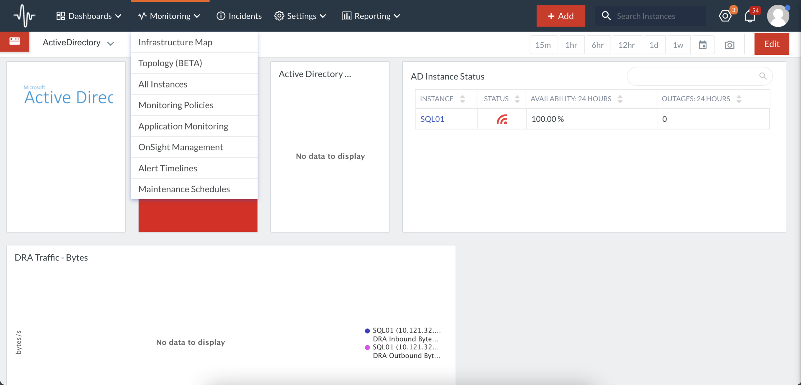
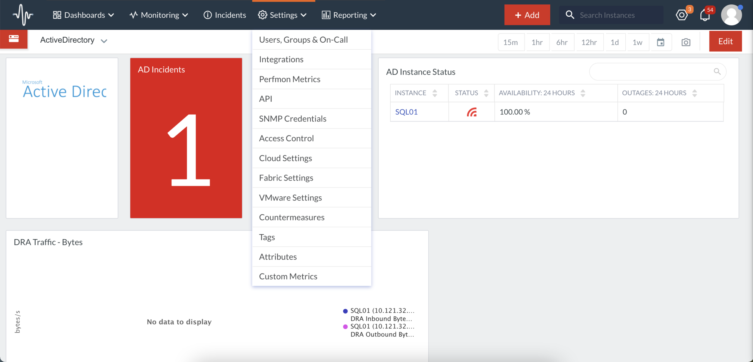
Final Designs - After IA revamp
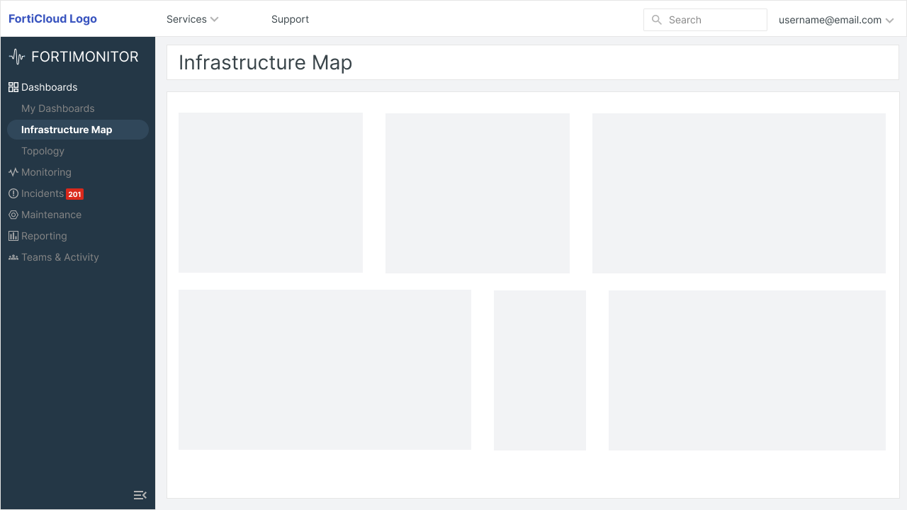
Dashboards – One item for all user-built dashboards (My Dashboards). Infrastructure Map, Topology and other future out-of-the-box visualizations live here.
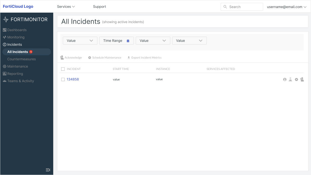
Consolidated everything involved in detecting and resolving incidents in one place.
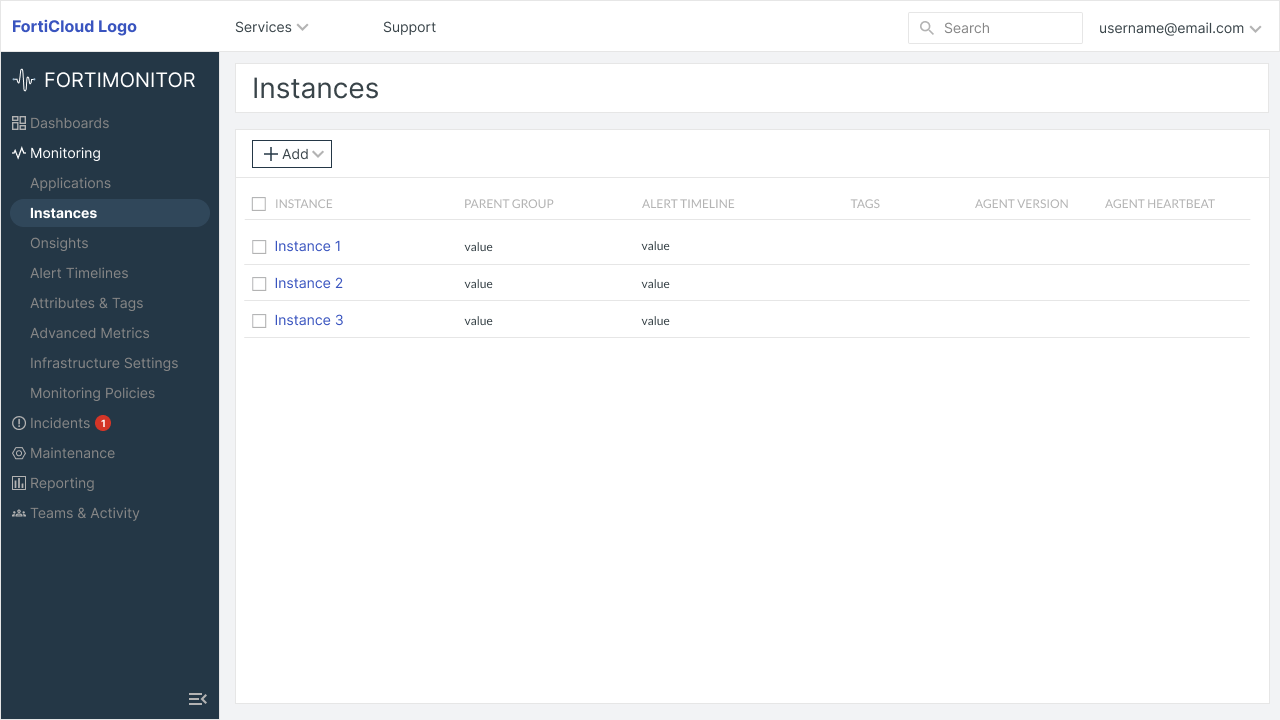
All monitored entities (Applications, Instances, Onsights, Public Probes) + the controls that shape them (Attributes & Tags, Advanced Metrics, Monitoring Policies).
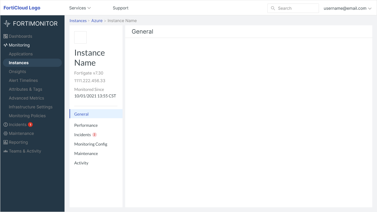
Reorganized the instance page – Replaced linear tabs and introduced a secondary left nav that makes this page faster to act on.
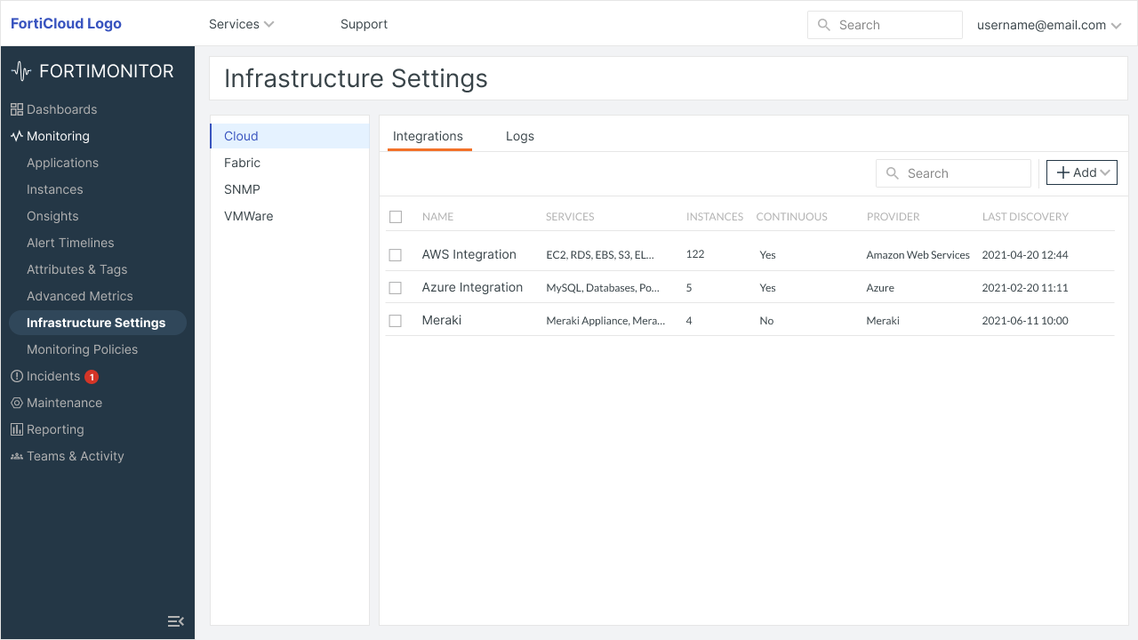
Three separate infrastructure connection settings (Cloud, Fabric, VMware) into a single Infra Settings item that’s more scalable for the future, when we add support for more connection settings like Meraki, Nutanix, and third-party integrations.
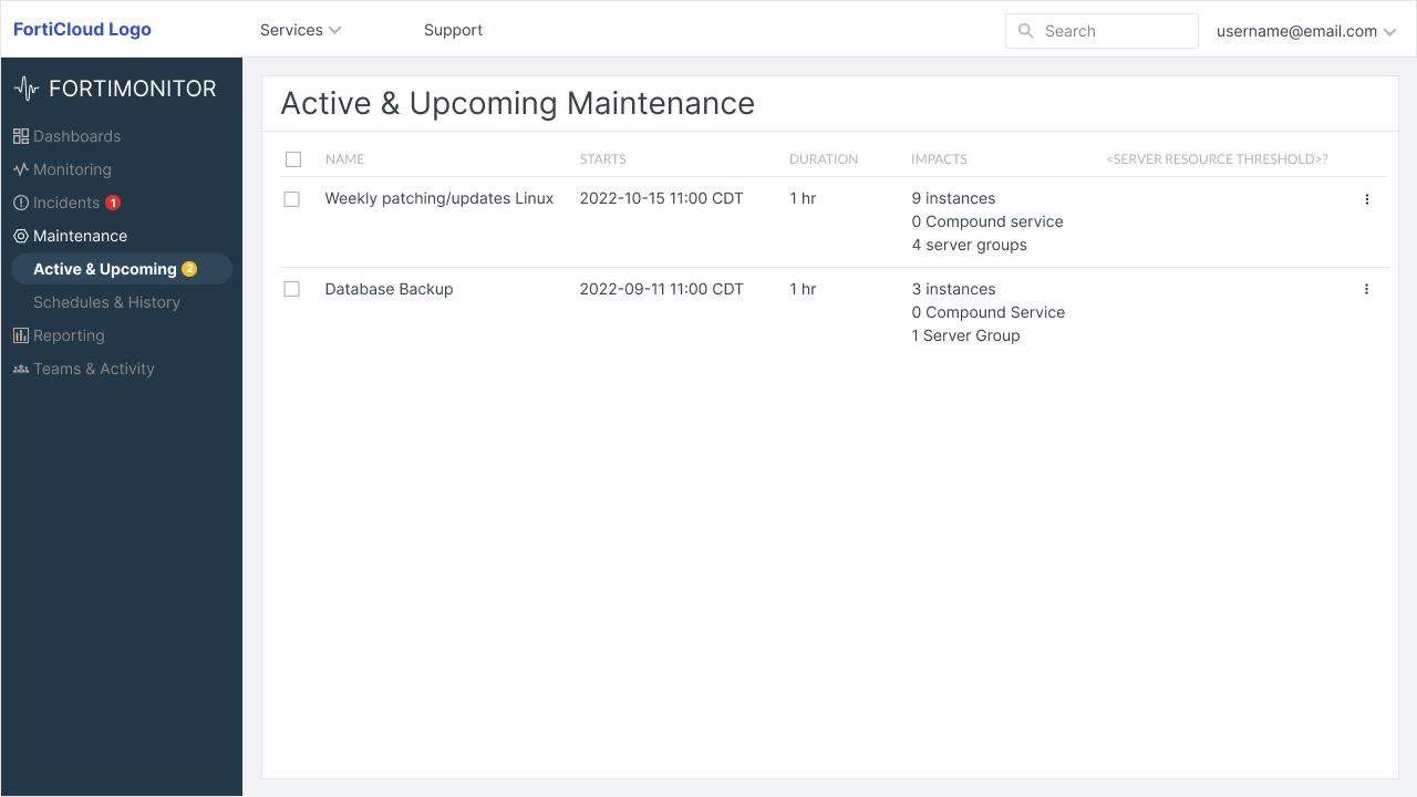
Previously buried workflow made a first-class entity, which ultimately improves discoverability.
Outcomes & Impact
Measured via moderated + unmoderated usability tests on the redesigned IA, compared against baseline tasks on the old structure / post-launch product analytics over 3 weeks.
- Task success rose from 50% to 80% — 8 of 10 participants completed the top tasks unaided after the redesign, versus 5 of 10 on the old IA (usability testing, n=10).
- 67% navigation directness — two-thirds of users reached their target without backtracking on the new structure (UXtweak tree test).
- Time-to-item cut from 30s to 18s — a 40% reduction (UXtweak tree test, old vs. new structure).
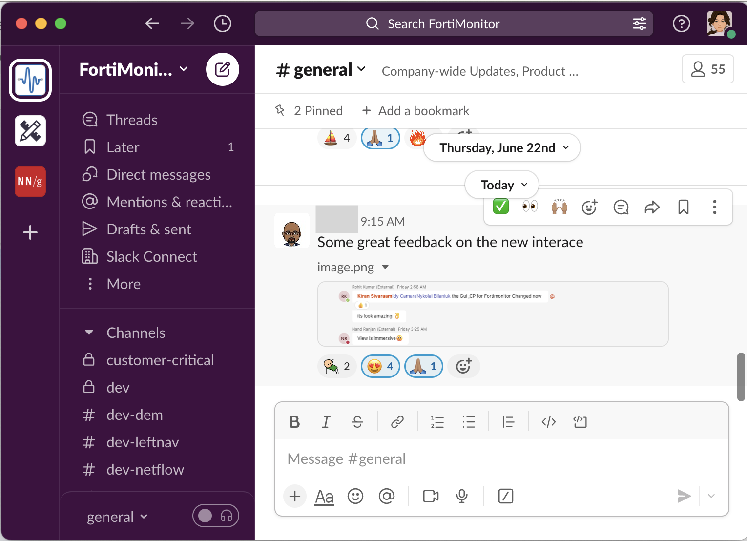
What Customers Said
The GUI for FortiMonitor has changed and it looks amazing 👌
View is immersive 😊